Improving Visual Analytics tools using data driven visualizations
Aug 18th, 2010 | By Prof. Dr. Giuseppe Santucci | Category: Featured Articles, NewsOne of the main Visual Analytics characteristics is the tight integration between automatic computation and interactive visualization. This generally corresponds to the availability of complex and powerful algorithms that allow for manipulating the data under analysis, transforming it in order to feed suitable visualizations. As an example, some Visual Analytics tools devoted to text analysis are based on the idea of extracting new data from the text (e.g., computing word frequencies or paragraph lengths) in order to produce visualizations that are based on these new derived pieces of information.
Broadening this approach and focusing on more general purpose automatic computations, this article discusses some data manipulation strategies that can be applied on the visualizations adopted in the analytical process, using the data values and the actual visualization. The purpose of this activity is to improve the overall image quality for the dataset at hand.
In the following we present different techniques that are able to improve the quality of widely used visualizations, like scatterplots, parallel coordinates, density maps, thematic maps, etc. The rationale underlying these techniques is either to reduce the data presented on the screen when the image is cluttered and/or to alter the adopted visual encoding (e.g., colour or size), analyzing the data distribution and considering perceptual issues.
Dealing with cluttered visualizations
In the last years a large number of clutter reduction techniques have been proposed (a survey is in [1]); here we present a computational approach that uses visual quality metrics and user studies. In the paper we use two running examples, i.e., 2D scatterplots and parallel coordinates; we believe, however, that the proposed method is general enough to be applied to many other visualizations.
The basic idea is to model the clutter in a formal way, computing some figures that can be used to drive/validate a clutter reduction algorithm. In particular we foresee four steps:
1) Model the clutter in the target visualization. The goal of this step is to define basic measures and formal models able to characterize numerically the visualization’s clutter.
2) Validate the measures against human perception. Figures are mandatory but human perception does not follow numbers in a straightforward way, so it is needed to understand how the figures we are dealing with are perceived by human eyes.
3) Define Visual Quality Metrics. Composing basic measures allows for devising more complete metrics about the overall image quality.
4) Use Visual Quality Metrics. User validated metrics are an objective way for validating/driving automatic clutter reduction techniques.
A complete model for characterizing the clutter of 2D scatterplots has been presented in [2], while a proposal for parallel coordinates is in [3]. Both proposals share the same idea: to analyze collisions and data densities in two different spaces: (1) an abstract, ideal space, with infinite resolution and (2) the real, discrete visualization space, with a finite number of pixels. In this way is possible to measure how a key data features (e.g., density differences) are correctly represented in the actual visualization. As an example, among many others, we define a visual quality metric measuring the percentage of density differences that are correctly represented on the actual visualization: we split the visualization spaces (ideal and real) in little squared areas (sample areas) and, considering all the possible sample area pairs, we compute how many existing data differences are lost because of pixel collisions.
Moreover, we investigate the way in which numerical density differences are perceived by human beings, computing what is the minimum difference in pixels between two sample areas that allows for perceiving a density difference.
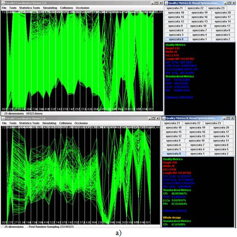
Using this perceptual validated visual quality metric we defined a non uniform sampling algorithm that samples each sample area in a different way, rescuing as many density differences as possible. A similar strategy has been devised for parallel coordinates. Figure 1 shows two examples of the application of this algorithm.
Figure 1: Visual data reduction rescuing density differences through visual quality metrics. The image shows a curative sampling algorithm applied to (a) parallel coordinates and (b) to 2D scatterplots. Visual quality metrics on the right allow for formally assessing the algorithm performances.
Dealing with visual data encoding
Colour and size are widely used in Visual Analytics visualizations. However, a straightforward mapping between data values and these visual variables may result in poor images. The paper analyzes the drawbacks rising from the commonly used strategies and introduces a technique able to improve the overall mapping process. The technique is driven by statistical knowledge about the data density distribution and a set of visual quality metrics allow for validating, in an objective way, its effectiveness. The framework defined in the paper is used to generate grey or colour scale density maps for 2D scatter plots; however it is the author’s belief that the method is general enough to be used in the assignment of any finite visual attribute, like size or line thickness, to a set of data values.
Several proposals exist for handling colour and size; most of them, however, do not scale well in case of highly skewed/long-tailed data density functions: many elements share low density values and few elements share very high density values. In this case the visualization loses its dynamic range and all visual items but few ones are represented with low values of colour or size.
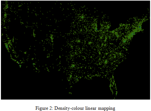
We introduce the problem using as an example the Infovis 2005 challenge dataset [4]: about 60,000 USA companies plotted on a 800×450 (360,000 pixels) scatter plot according to the companies’ location. For rounding issues, several companies collide on the same pixel and a common solution is to map the number of colliding elements to a colour scale. However, a simple linear mapping between collisions and colours produces a very poor image (see Figure 2).
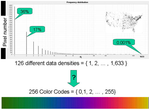
The problem rises from the very odd density distribution (see Figure 3).
Figure 3: Pixel density distribution and mapping constraints
Collisions (data density values) range from 1 to 1633 (126 different values), and more than 50% of the pixels host 1 or 2 companies; only one pixel hosts 1633 companies. It is worth noting that the non uniform behaviour of the frequency distribution presented above, is not an exception of the specific example but a common case in data analysis: we tested different real data sets and the large majority present a similar frequency distribution.
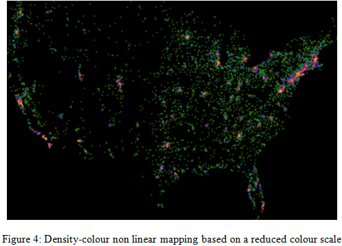
Assuming to use a 256 colour scale, the problem is to associate each density to a different colour, overcoming the problems associated with the linear mapping. Our approach (details are in [5]) is mainly based on the idea of increasing the number of perceivable density differences, bearing several kinds of distortion (non linear mapping). Moreover, in order to increase the colours’ separation, making differences more visually evident, we used a colour scale characterized by a deliberately reduced number of values.
Summarizing, the algorithm is driven by three main objectives:
- it uses as many colour tones as possible;
- it maximizes the distance among used tones;
- when density collisions are unavoidable (i.e., we are using the same colour for different densities) it tries to uniformly distribute collisions among the used colour values, producing a colour frequency distribution as uniform as possible.
Figure 4 shows the result of this approach.
The algorithm’s performances are validated through three metrics, that measure how many colour codes and what part of the colour scale the mapping uses, and how distinguishable are the used colours.
References
[1] G. Ellis and A. Dix. A taxonomy of clutter reduction for information visualization. In Proceedings of IEEE Visualization, October 2007.
[2] E.Bertini, G. Santucci – Give chance a chance: modeling density to enhance scatter plot quality through random data sampling – Information Visualization, Vol. 5, No. 2, pp. 95-110, 25 May 2006.
[3] E. Bertini, G. Santucci. A methodological framework for automatic clutter reduction in Visual Analytics Proc of DMS 2009, 15th International Conference on Distributed Multimedia Systems, San Francisco Bay, USA, September 2009.
[4] Infovis Challenge 2005. http://www.public.iastate.edu/~hofmann/infovis/
[5] E. Bertini, A. Di Girolamo, G.Santucci - See what you know: analyzing data distribution to improve density map visualization – Proceedings of the International Eurovis 2007 conference, May 2007, Norrkoping, Sweden.


